
Printing mistakes can be expensive.
A small typo, a blurry logo, missing bleed, wrong size, or incorrect color setup may not seem like a big issue on screen. But once the file is printed, that small mistake can turn into a costly reprint.
Whether you are ordering banners, yard signs, decals, business cards, vehicle magnets, apparel transfers, rigid signs, or promotional materials, proper file preparation can save time, money, and stress.
The good news is that most print mistakes are preventable.
By understanding the most common problems before sending your artwork to production, you can avoid delays, reduce extra costs, and get a final product that looks clean, professional, and ready to use.
Here are five common mistakes that lead to costly reprints and how to avoid them.
Why Reprints Happen
A reprint usually happens when the final printed product does not match what the customer expected or when the file contains an error that affects the finished result.
Some reprints are caused by production issues, but many are caused by artwork problems that were present before printing.
Common reasons include:
- Low-resolution images
- Missing bleed
- Text too close to the edge
- Wrong product size
- Incorrect file format
- Spelling mistakes
- Wrong phone number or website
- Poor color setup
- Missing fonts
- QR codes that do not scan
- Artwork not designed for the final material
Before ordering, it is important to check both the design and the technical file setup.
Mistake 1: Using Low-Resolution Images

One of the most common causes of poor print quality is low-resolution artwork.
A design may look fine on a computer screen or phone, but that does not mean it will print clearly at full size. Screens are much smaller than physical signs, banners, and printed products. When a low-quality image is enlarged, it can become blurry, pixelated, or soft.
This is especially common when customers use:
- Screenshots
- Images copied from websites
- Social media images
- Small logo files
- Compressed files from messaging apps
- Photos saved at low quality
- Old artwork files
- Preview images instead of original files
If the image is low quality in the file, it will usually look low quality when printed.
Why This Mistake Can Be Expensive
Low-resolution artwork can make the entire print look unprofessional.
For example, a blurry logo on a business sign can make the brand look less trustworthy. A pixelated photo on a banner can make the promotion look cheap. A soft QR code may not scan properly.
If the final product looks poor, the only solution may be to redesign the file and print again.
How to Avoid Low-Resolution Problems
Use high-resolution files whenever possible.
For logos, use vector files such as AI, EPS, SVG, or a print-ready PDF. Vector files can be scaled without losing quality.
For photos and raster images, use high-resolution files prepared at the correct print size.
Before submitting artwork, zoom in and check the quality. If the image looks blurry or pixelated on screen, it may print that way too.
Best Practice
Avoid using screenshots as final artwork. Use original design files, high-resolution images, or vector logos.
If you are not sure whether your file is high enough quality, ask for a file review before production.
Mistake 2: Forgetting Bleed and Safe Area
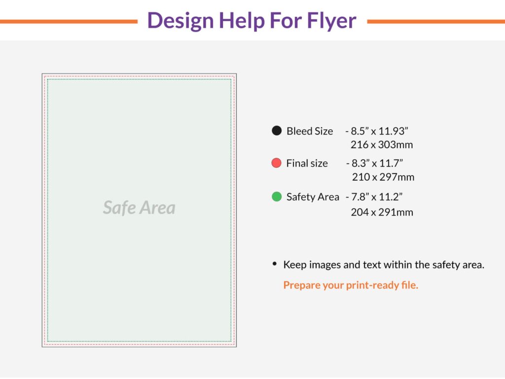
Bleed and safe area are two of the most important parts of print file preparation.
Bleed is the extra artwork that extends beyond the final trim edge. It helps prevent unwanted white borders after the product is cut.
Safe area is the inner margin where important text, logos, QR codes, and contact details should stay. It helps prevent important content from being cut off during trimming or finishing.
Many costly reprints happen because the artwork was designed exactly to the final size without extra bleed, or because important text was placed too close to the edge.
Why Bleed Matters
During trimming, even a tiny movement can create a visible white edge if the artwork does not extend past the cut line.
This is especially noticeable on designs with:
- Full-color backgrounds
- Photos that reach the edge
- Patterns
- Solid color blocks
- Borders
- Edge-to-edge graphics
Without bleed, the final print may not look clean or professional.
Why Safe Area Matters
Important information should never sit too close to the edge.
This includes:
- Phone numbers
- Website URLs
- Logos
- QR codes
- Headlines
- Addresses
- Social media handles
- Arrows
- Important icons
If these elements are too close to the cut line, they may look crowded or may be partially trimmed.
How to Avoid Bleed and Safe Area Problems
Always check the product file requirements before uploading artwork.
Make sure background colors, photos, and patterns extend into the bleed area. Keep important text and logos inside the safe area.
For signs with finishing options such as grommets, drill holes, rounded corners, or contour cutting, leave extra space around those areas.
Best Practice
Do not place borders too close to the edge. Even a small trim shift can make a thin border look uneven.
A clean design with proper margins will usually look more professional than a crowded design.
Mistake 3: Choosing the Wrong Size or Orientation
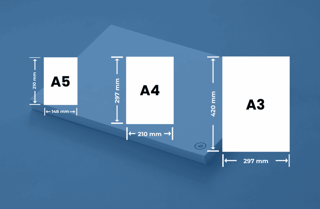
Another common reprint problem is ordering the wrong size or submitting artwork in the wrong orientation.
For example, a customer may order a 24″ x 36″ sign but submit artwork designed as 36″ x 24″. The size may be correct, but the orientation is different. This can cause the layout to appear rotated, stretched, cropped, or incorrectly scaled.
This mistake can also happen with banners, yard signs, posters, decals, and rigid signs.
Why Size and Orientation Matter
Print products are produced based on the selected size and file setup.
If the artwork does not match the final product size, several issues can happen:
- Text may appear too small
- Images may be stretched
- The design may be cropped
- Important content may be cut off
- The layout may not fit the product
- The sign may not work in the intended location
A design that looks good in one size may not work well when resized to another format.
Common Size Mistakes
Common size-related mistakes include:
- Reversing width and height
- Designing in inches but exporting in pixels incorrectly
- Uploading a file with the wrong dimensions
- Using artwork from another product size
- Forgetting to scale large-format signs properly
- Ordering a sign that is too small for the viewing distance
- Not checking if the sign fits the installation space
These mistakes can lead to delays or reprints if the final product does not meet expectations.
How to Avoid Size and Orientation Problems
Before ordering, confirm:
- Final width
- Final height
- Portrait or landscape orientation
- Single-sided or double-sided printing
- Mounting location
- Viewing distance
- Product material
- Finishing options
If the sign will be installed in a specific space, measure that space carefully before placing the order.
Best Practice
Create artwork at the final print size whenever possible.
If you are designing at a scaled size for a large-format product, make sure the file is prepared proportionally and at the correct resolution.
Mistake 4: Not Proofreading Text and Contact Information
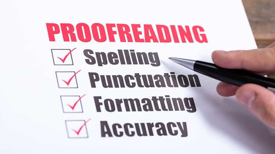
Typos are one of the most frustrating reprint mistakes because they are usually easy to prevent.
A misspelled word, wrong phone number, outdated website, incorrect address, or broken QR code can make an entire print order unusable.
This is especially costly when ordering in bulk.
Common Text Mistakes
Common proofreading mistakes include:
- Misspelled business name
- Wrong phone number
- Incorrect website
- Old address
- Missing email address
- Wrong event date
- Incorrect pricing
- Typo in service name
- Wrong social media handle
- Incorrect QR code link
- Missing disclaimer or required information
Even one incorrect digit in a phone number can make a sign ineffective.
Why Proofreading Matters
Printed products are physical materials. Once they are produced, text cannot be edited like a website or digital ad.
If the mistake is important, the product may need to be reprinted.
This is especially important for:
- Business cards
- Flyers
- Menus
- Real estate signs
- Event banners
- Yard signs
- Vehicle magnets
- Product labels
- QR code signs
- Promotional materials
Proofreading should always happen before final approval.
How to Avoid Text Mistakes
Do not rely only on spell check. Spell check may not catch wrong names, incorrect phone numbers, bad URLs, or correct words used in the wrong place.
Before approving the file, check:
- Business name
- Phone number
- Website
- Email address
- Physical address
- Dates and times
- Prices
- QR code destination
- Social media handles
- Product names
- Legal or safety information
It is also helpful to have another person review the file. A fresh set of eyes can catch mistakes you may miss.
Best Practice
Read the text out loud and check every number one digit at a time.
For QR codes, scan the code with a phone before printing and confirm that it opens the correct page.
Mistake 5: Ignoring Color Mode and Material Differences
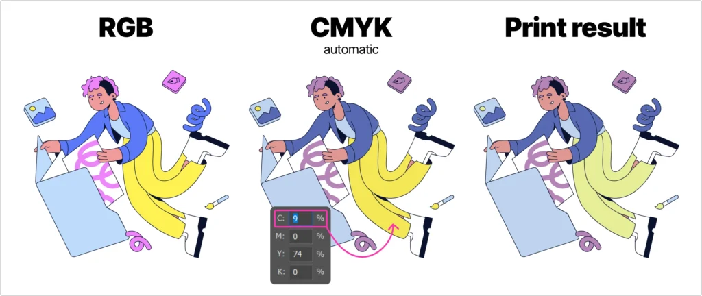
Color is another common reason customers may be surprised by the final print.
A design may look bright and vibrant on screen, but the printed version may look slightly different. This happens because screens and printers create color differently.
Screens use RGB color, while most printing uses CMYK color. Screens create color with light, while print creates color with ink on a physical material.
Because of this, printed colors may not always match the screen exactly.
Why Color Differences Happen
Colors can change depending on:
- RGB to CMYK conversion
- Screen brightness
- Monitor calibration
- Printer type
- Ink type
- Material surface
- Gloss or matte finish
- Lighting conditions
- Lamination
- Fabric or substrate texture
A bright neon color on screen may look more muted in print. A color printed on gloss vinyl may look different from the same color printed on matte vinyl, fabric, Coroplast, PVC, or acrylic.
Why This Can Lead to Reprints
If a customer expects the printed color to match the screen exactly, they may be disappointed when the final product looks slightly different.
This can be especially important for brand colors, product labels, corporate signage, vehicle graphics, and retail displays.
How to Avoid Color Problems
Design in CMYK when preparing artwork for print whenever possible.
Avoid relying only on screen appearance, especially if your screen brightness is high.
Use official brand color values if available. If color accuracy is very important, request a proof or sample before printing a large order.
Also remember that material matters. A matte finish may look softer, while gloss may look more vibrant. Fabric may absorb color differently than rigid materials.
Best Practice
For brand-sensitive projects, use print-ready files and confirm color expectations before production.
Understand that screen-to-print color matching is not always exact, but good file preparation can reduce surprises.
Bonus Mistake: Sending the Wrong File Format
The wrong file format can also cause production issues.
For example, sending a Word document, screenshot, low-quality JPEG, or flattened preview file may not provide enough quality for professional printing.
Better File Formats for Print
Common print-friendly file formats include:
- AI
- EPS
- SVG
- High-resolution PNG
- High-resolution JPEG
A print-ready PDF is often one of the safest options for many projects.
For logos and line art, vector files are best. For transparent designs, high-resolution PNG files may be useful. For photos, high-quality JPEG files may work if they are large enough.
File Format Problems to Avoid
Avoid sending:
- Screenshots
- Low-resolution web images
- Word documents as final artwork
- PowerPoint files as final artwork
- Compressed images from messaging apps
- Photos of printed designs
- Files with missing fonts
- Files with missing linked images
These files may be useful as references, but they are usually not ideal as final print artwork.
Bonus Mistake: Not Considering Finishing Options
Finishing options can affect how the final product looks and where important design elements should be placed.
Common finishing options include:
- Grommets
- Hemming
- Rounded corners
- Drill holes
- Stand-offs
- Lamination
- Contour cutting
- Double-sided printing
- Pole pockets
- Mounting hardware
If your design does not leave enough room for finishing, important text or graphics may be affected.
For example, a phone number placed too close to a grommet location may look awkward. A border placed too close to rounded corners may appear uneven. A cut line too close to small text may make the design hard to produce cleanly.
How to Avoid Finishing Issues
Before finalizing artwork, check what finishing options are selected.
Leave enough space around:
- Grommet areas
- Drill holes
- Rounded corners
- Cut lines
- Folded or hemmed areas
- Mounting hardware
- Edges and corners
A good design should account for both printing and finishing.
Pre-Print Checklist to Avoid Costly Reprints
Before submitting your file, review this checklist:
- Is the file the correct size?
- Is the orientation correct?
- Is there proper bleed?
- Are important elements inside the safe area?
- Are images high resolution?
- Is the logo sharp?
- Are fonts outlined or embedded?
- Is the color mode prepared for print?
- Is all contact information correct?
- Has the text been proofread?
- Does the QR code scan correctly?
- Is the file format print-ready?
- Are finishing areas clear?
- Are front and back files correct if double-sided?
- Is the design suitable for the selected material?
- Has the proof been reviewed carefully?
Taking a few minutes to check these details can save the cost of a full reprint.
How to Review a Proof Properly
A proof is your final chance to catch mistakes before printing.
When reviewing a proof, do not only look at the overall design. Check every detail carefully.
Review:
- Text
- Spelling
- Contact information
- Size
- Layout
- Alignment
- Colors
- Margins
- QR code
- Logos
- Images
- Dates
- Prices
- Product options
- Front and back sides
If multiple people are involved in the project, make sure the right person approves the final proof.
Why Rushing Leads to Mistakes

Many reprints happen because the order was rushed.
When customers need signs or banners quickly, they may skip proofreading, upload the wrong file, or approve a proof too fast.
Rush orders can still be successful, but the file must be checked even more carefully.
Before approving a rush print, slow down for a few minutes and review the most important details.
A fast order with a mistake can become slower and more expensive than a carefully checked order.
Final Recommendation
Most costly reprints can be avoided with careful file preparation and proof review.
The five biggest mistakes to avoid are:
- Using low-resolution images
- Forgetting bleed and safe area
- Choosing the wrong size or orientation
- Not proofreading text and contact information
- Ignoring color mode and material differences
Before sending your file to print, make sure the artwork is high quality, correctly sized, easy to read, and ready for the selected product.
A clean print-ready file helps your order move faster and gives you a better final result.
FAQ
What causes most print reprints?
Most reprints are caused by low-resolution artwork, missing bleed, incorrect size, typos, wrong contact information, color expectations, or file setup issues.
Can a low-resolution image be fixed?
Sometimes it can be improved, but low-resolution images cannot always be made sharp. It is best to use the original high-resolution image or vector artwork.
What is bleed in printing?
Bleed is the extra artwork area that extends beyond the final trim edge. It helps prevent white borders after cutting.
Why do I need a safe area?
The safe area keeps important text, logos, QR codes, and contact details away from the edge so they do not get cut off or look too crowded.
Why do printed colors look different from my screen?
Screens use RGB light, while print uses CMYK ink. Material, finish, lighting, and printer settings can also affect color appearance.
Is a screenshot good enough for printing?
Usually no. Screenshots are often too low resolution for professional printing and may look blurry or pixelated when enlarged.
What is the best file format for printing?
A print-ready PDF is often a strong choice. AI, EPS, SVG, high-resolution PNG, and high-resolution JPEG files may also work depending on the product.
Should I proofread even if the design looks correct?
Yes. Always proofread spelling, phone numbers, website URLs, dates, prices, and QR codes before approving production.
Can QR codes cause reprint problems?
Yes. If a QR code is too small, low resolution, distorted, or linked to the wrong page, it may not scan properly and could require a reprint.
Can Gigantic Prints help check my file before printing?
Yes. Gigantic Prints can help review your artwork and guide you through file preparation before production.
Ready to Print It Right the First Time?
Avoiding reprints starts with the right file, the right material, and the right proofing process.
Whether you need banners, signs, decals, yard signs, vehicle magnets, apparel prints, or rigid boards, Gigantic Prints can help you prepare your artwork for professional printing.
Start your next print project with Gigantic Prints today and get high-quality results without avoidable reprint mistakes.