Posted on Leave a comment

Wrap Design & Branding That Gets Calls: A Practical Guide to Readability, Trust, and Consistent Vehicle Graphics

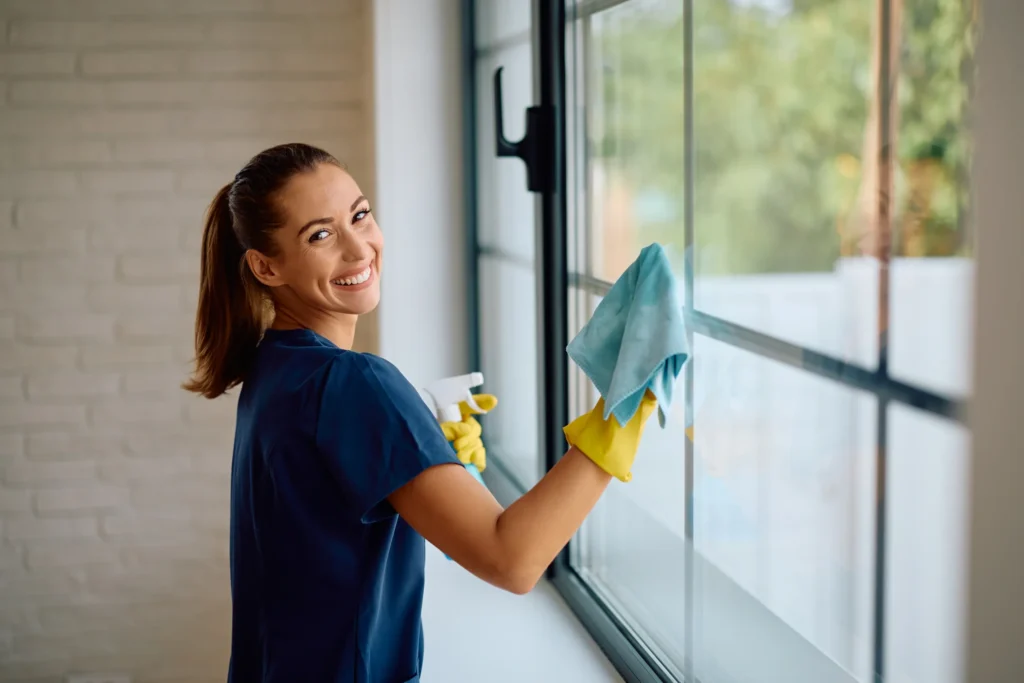
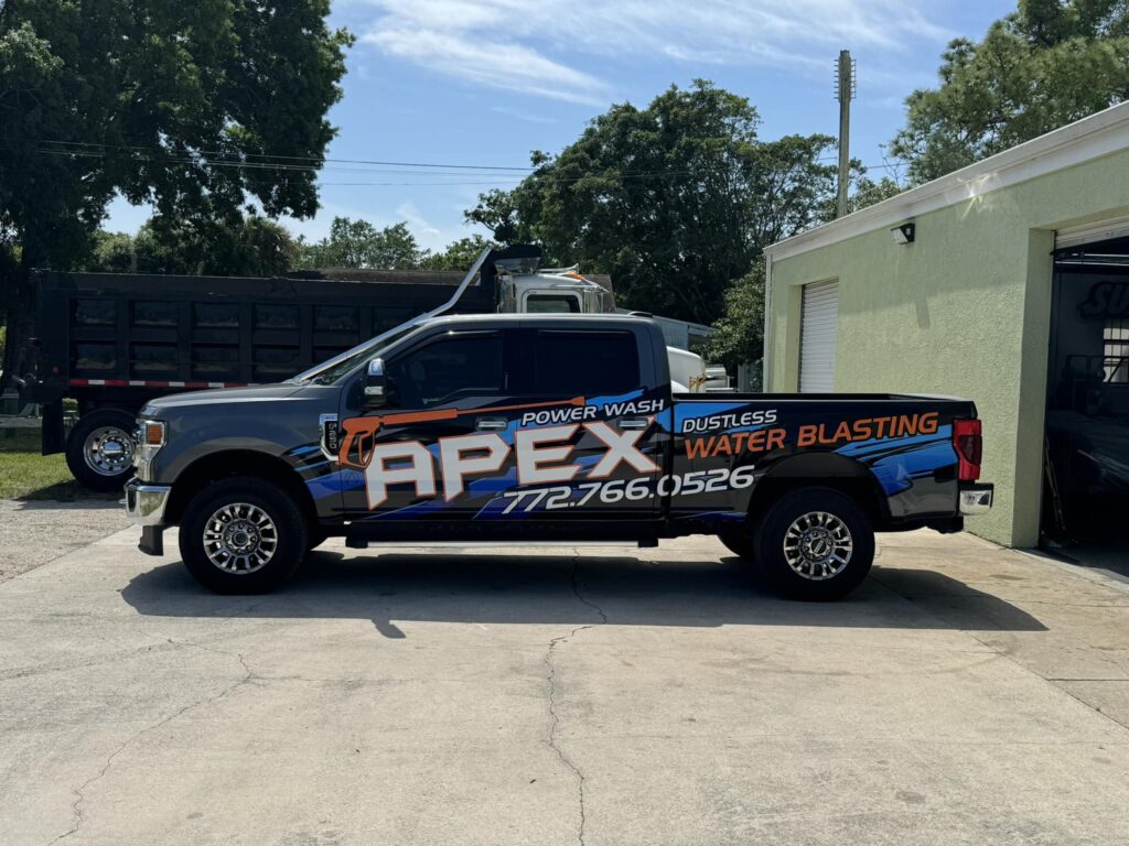
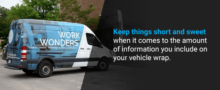
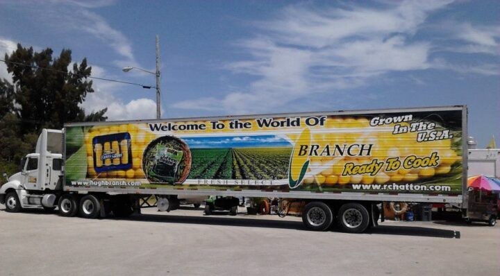
If you’ve ever seen a work van on the road and instantly thought, “That company looks legit,” you already understand the real power of design.

Not the “pretty” kind of design. The kind that works at 35 mph. The kind that can be read in two seconds at a stoplight. The kind that makes someone save your number without even realizing it.

That’s what this blog is about: wrap design and branding education that helps you turn vehicle graphics into real-world results more recognition, more trust, and more calls.

The uncomfortable truth: most vehicle graphics fail for one simple reason

They try to say too much.

A vehicle is not a brochure. It’s not a website. It’s not a flyer.

Your customer is not sitting down to “review your design.” They’re driving. Walking. Turning their head for a second. They’re busy.

So when a design tries to include every service, every tagline, every social handle, three phone numbers, and a list of certifications… the result is predictable:

They remember nothing.

The best vehicle graphics don’t win by being louder. They win by being clear.

The 3-second rule: how people actually read vehicle wrap design

Here’s what happens in the real world:

  1. They notice color and shape first
  2. Their eyes snap to the biggest text or logo
  3. They try to answer one question: “What do they do?”
  4. If that’s clear, they look for: “How do I contact them?”

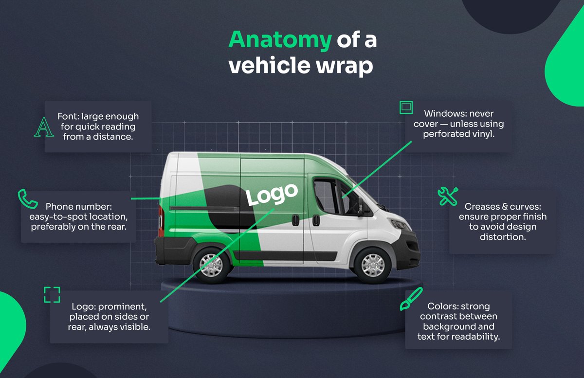
This is why successful vehicle wrap design follows a strict hierarchy:

The winning hierarchy for business vehicle graphics

  1. Brand name / logo
  2. What you do (one clear service line)
  3. Phone number (easy to read)
  4. Website / location (optional, secondary)
  5. Trust signal (optional, minimal)

If your design breaks this order, conversion drops no matter how nice it looks on screen.

Principle 1: Design for readability at speed (not for your monitor)

A wrap that looks perfect in a design mockup can fail on the road.

Why? Because monitors don’t simulate:

  • distance
  • motion blur
  • glare
  • nighttime lighting
  • visual clutter (traffic, buildings, signs)

Quick test: “The 30-foot squint”

Stand 30 feet away from the design (or zoom out until it’s small), squint slightly, and ask:

  • Can I read the company name?
  • Can I understand the service?
  • Can I find the phone number instantly?

If not, simplify.

Readability checklist for vehicle lettering

  • Use bold, clean fonts (avoid thin scripts for key info)
  • Increase spacing (kerning/leading) for legibility
  • Keep service line short (3–6 words is often ideal)
  • Prioritize contrast (dark on light, light on dark)

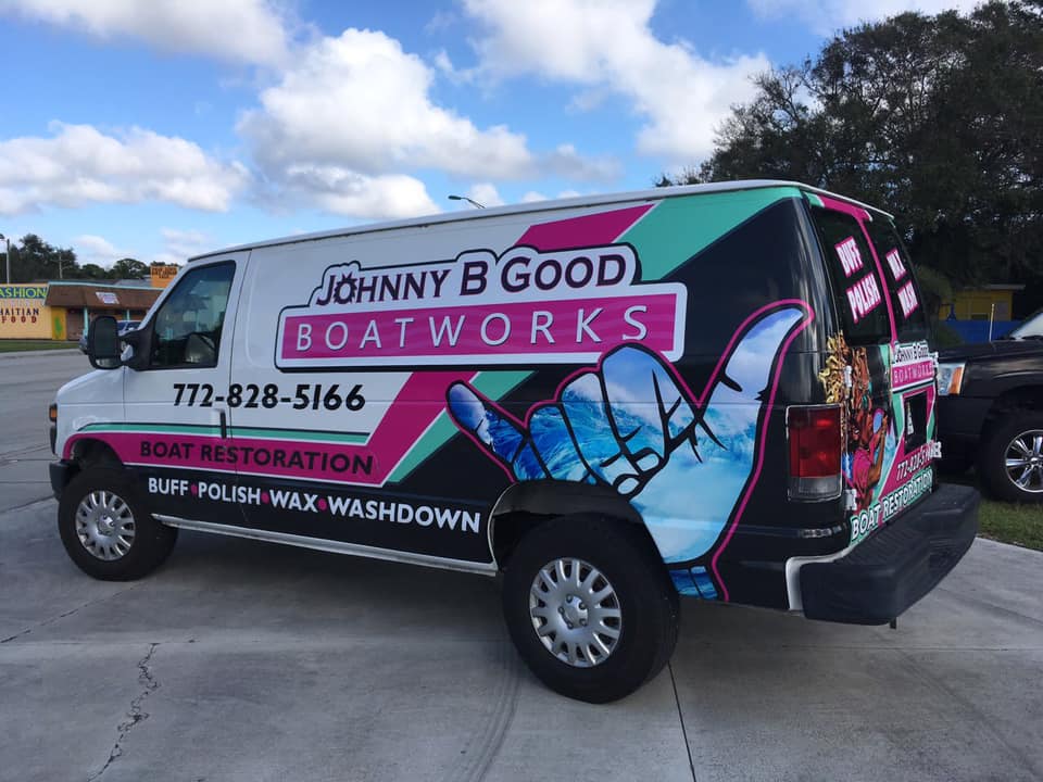
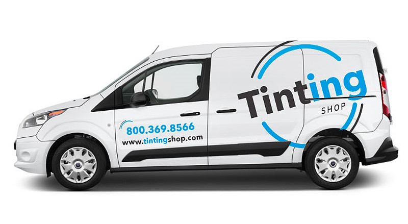
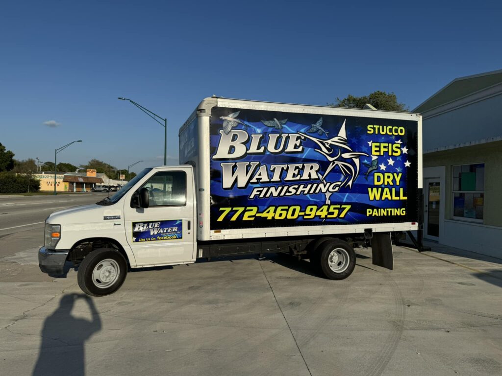
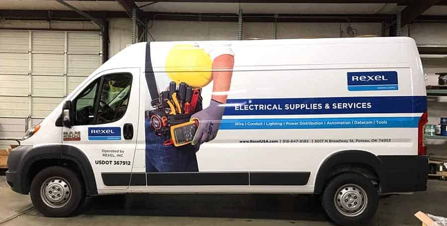
Principle 2: Your phone number is not decoration. It’s the conversion button.

A business wrap is a moving call-to-action. Treat your phone number like the “Buy Now” button on a website.

Best placement for phone numbers (high-conversion zones)

  • Rear of vehicle: highest conversion zone (drivers behind you have time to read)
  • Large side panel: high visibility while parked or passing
  • Avoid low, dirty areas: near wheel wells where road grime reduces readability

Phone number size and style guidelines

  • Make it one of the largest text elements on the vehicle
  • Use a bold font with clean shapes (no fancy curves)
  • Separate it from clutter (white space is your friend)
  • Keep it consistent across the fleet

If you want more calls from vehicle graphics, this is the simplest improvement with the biggest payoff.

Principle 3: Color contrast is your “silent salesperson”

People think color is about style. In vehicle graphics, it’s mostly about function.

The contrast rule

If the background and text are too close in brightness, the text disappears in sunlight and at speed.

High-performing combinations (in real environments):

  • white text on deep black/navy
  • black text on white/light gray
  • bright accent colors only when paired with strong contrast

Don’t “brand yourself into invisibility”

Some brands love light gray-on-white because it feels “premium.” On a vehicle, it often reads as “blank.”

If you want premium and readable:

  • use clean layouts
  • use fewer elements
  • keep contrast strong

Premium is clarity, not softness.

Principle 4: Logo placement that builds trust instantly

Your logo is not just a symbol—it’s the first proof that you’re a real company.

Best logo placement

  • Front doors: classic, professional, expected
  • Mid-side panel: maximum visibility on vans/trucks
  • Rear: reinforces brand recall after they read the phone number

Biggest logo mistake

Putting the logo too small and expecting it to “carry the design.”

If your logo is small and your service text is huge, people remember the service but not your name. If your logo is huge but your service is unclear, they remember the brand but not what you do.

Balance matters.

Principle 5: The “one message” approach beats the “everything list”

If you offer 12 services, your wrap should not list 12 services.

Your wrap needs one primary message that people can remember.

Examples of strong one-line service messaging

  • “AC Repair & Installation”
  • “Plumbing • Drain • Water Heaters”
  • “Roofing & Storm Restoration”
  • “Towing • Recovery • Roadside”

The goal is not completeness. The goal is clarity.

If someone understands you, they’ll call. Once they call, you can explain everything you do.

Principle 6: Trust signals work—if you keep them minimal

People buy from companies they trust. A wrap can communicate trust without looking crowded.

High-impact trust signals (choose 1–2)

  • “Licensed & Insured”
  • “Family Owned”
  • “5-Star Rated”
  • “Since 2012”
  • “Free Estimates”

The key is restraint. Add too many trust badges, and they become noise.

Principle 7: Consistency across vehicles is what makes you look bigger

A single branded vehicle looks professional.

A consistent fleet looks established.

If you have multiple vehicles, consistency becomes a sales tool:

  • customers recognize you faster
  • your brand feels “everywhere”
  • your team looks organized on job sites

Fleet consistency essentials

  • same logo placement rules across vehicles
  • same core colors and font system
  • same service line format
  • same phone number position and size hierarchy

This is branding that customers can feel even if they can’t explain it.

The simple layout formula that converts (steal this)

Use this structure for most service businesses:

Side panel layout

  • Large logo or brand name
  • One clear service line
  • Big phone number
  • Optional: website or area served (small)

Rear layout

  • Big phone number first
  • Website second
  • Small logo for reinforcement
  • Optional: short CTA (“Call Today” / “Free Estimates”)

This layout works because it follows how people scan vehicles naturally.

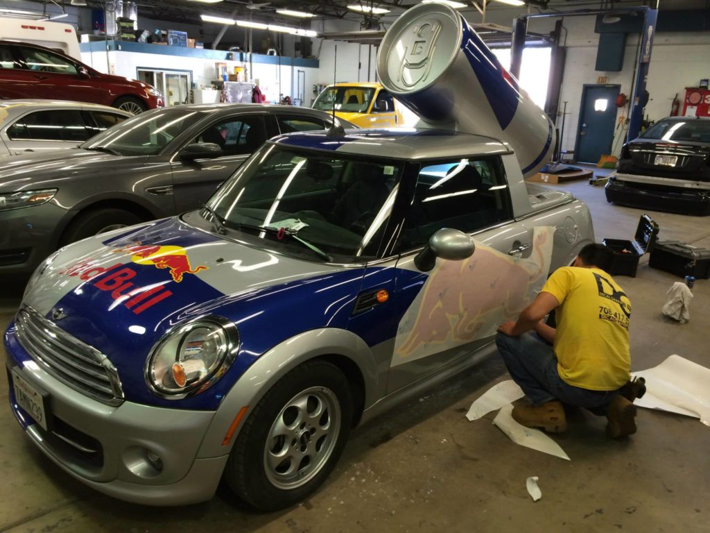
A quick story: why “clean design” often outperforms “creative design”

A business owner once asked for a wrap with:

  • 10 services
  • 2 taglines
  • 3 icons per service
  • a background pattern
  • social handles
  • QR code
  • and a gradient overlay

It looked impressive on the mockup.

But in real life? At speed? It was a blur.

When we simplified to:

  • brand
  • one service line
  • one CTA
  • one phone number

The vehicle finally worked like advertising because people could read it.

Great vehicle wrap design isn’t about showing everything. It’s about making the right thing impossible to miss.

Wrap Design Checklist (before you approve your final proof)

Use this before you print anything:

  1. Can someone read your company name in 2 seconds?
  2. Can they understand what you do without effort?
  3. Is your phone number one of the biggest elements?
  4. Is the contrast strong in bright sunlight?
  5. Does the design still work when you zoom out small?
  6. Is the layout consistent with your other vehicles or signage?
  7. Is the message short enough to remember?

If you answer “no” to any of these, revise before printing.

FAQ: Design & Branding for Vehicle Wraps and Decals

What’s the best font for vehicle lettering?

Bold, clean, highly legible fonts perform best. Thin scripts and decorative fonts usually fail at speed.

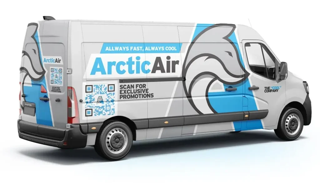
Should I add a QR code to my vehicle graphics?

Only if it’s large enough and placed where people can realistically scan (parked locations). Most “on-road” QR codes don’t convert well compared to a clear phone number.

How much text is too much on a wrap?

If it can’t be read in 2–3 seconds, it’s too much. Prioritize one message and one action.

What’s more important: logo or phone number?

For conversion, phone number placement and readability are critical. For recall, logo matters. The best designs make both clear, but the phone number usually deserves bigger priority on the rear.

Want a Wrap/Decal Design That Actually Gets Calls?

If your goal is more leads not just a nice-looking vehicle start with the essentials:

Send:

  • your vehicle type (year/make/model or photo)
  • your logo (any format you have)
  • your core service line (one sentence)
  • your phone number and website

And we’ll help you build a layout that’s:

  • readable at speed
  • clean and professional
  • consistent with your brand
  • optimized for calls and quotes

Posted on Leave a comment

Vehicle Decal Installation Guide: How to Apply Car Decals Like a Pro (and Turn Your Vehicle Into a Moving Billboard)

There’s a moment most local business owners never forget.

You’re sitting at a red light. A plain white van pulls up beside you,nothing flashy, nothing expensive. But something about it feels immediately trustworthy: a clean logo, bold brand colors, a service line you can read in one glance, and a phone number placed exactly where your eyes naturally land.

You don’t need that service today.

But next week, when your AC stops working, when you need a contractor, when you’re looking for a towing company, you remember that van. You remember the name. You remember the number.

That’s not luck. That’s what happens when vehicle decals are designed and installed the right way.

Why Vehicle Decals Still Deliver the Best Local Advertising ROI

You can run ads every day, change your copy weekly, and keep paying for impressions you don’t own.

Or you can invest once in business vehicle decals ,and let your brand show up everywhere your vehicle goes.

A vehicle with clean vehicle lettering and a clear message doesn’t just look better. It communicates:

  • “We’re legitimate.”
  • “We’re established.”
  • “We show up professionally.”
  • “You can trust us.”

That’s why vehicle decals work especially well for local service businesses, HVAC, plumbing, landscaping, towing, cleaning, electricians, contractors, and fleets that need consistent branding.

A decal doesn’t chase customers. It builds recognition before they need you, so when the time comes, you’re already the obvious choice.

Vehicle Decals vs Vehicle Wraps: What’s the Difference?

Before we dive into the step-by-step process, let’s clarify a common misunderstanding.

Vehicle decals (vinyl decals / vehicle lettering)

  • Logos, text, phone numbers, websites, icons, small-to-medium graphics
  • Faster installation
  • Budget-friendly
  • Perfect for clean, professional branding

Vehicle wraps (partial wrap / full wrap)

  • Large coverage (panels or full vehicle)
  • Strong transformation
  • More design + install time
  • Higher visual impact

If your goal is professional brand presence without full wrap cost, car decals are often the smartest move. You can always upgrade to a partial or full wrap later.

Part 1: What You Need Before You Install a Vehicle Decal

If decals bubble, wrinkle, or lift at the edges, it’s usually not because someone “has bad hands.”

It’s because the prep was wrong.

1) Choose the right vinyl (don’t treat all vinyl the same)

Not all vinyl decals are built for vehicles.

In general:

  • Cast vinyl (premium): flexible, conforms well, better durability, ideal for curved surfaces and long-term outdoor use
  • Calendared vinyl (economy): works on flatter areas, shorter lifespan, more prone to shrinkage over time

If this is for a business vehicle, premium materials pay for themselves, because peeling edges and fading graphics don’t just look bad… they reduce trust.

2) Pick the right placement (based on how people actually look)

A great decal is readable in 2–3 seconds.

High-performing zones:

  • Front doors: logo + short service line
  • Side panels: logo + service + phone number
  • Rear (back doors / tailgate): phone + website large (drivers behind you have time to read)

Pro tip: stand 15–30 feet away. If you can’t read it instantly, the design is too busy or too low-contrast.

3) Tools for professional decal application

If you want a clean result, have these ready:

  • Felt-edge squeegee (prevents scratches)
  • Sharp utility knife (new blade)
  • Masking tape (for alignment + hinge method)
  • Measuring tape + level reference points
  • Microfiber towels (lint-free)
  • Isopropyl alcohol (IPA) for final cleaning
  • Heat gun (only for controlled use on curves/edges)

4) Ideal installation conditions

  • Indoor space (garage/shop), minimal dust
  • Moderate temperature (avoid extreme cold/heat)
  • No direct sunlight on the panel you’re installing

Part 2: Surface Prep (Where 80% of Decal Failures Come From)

A clean-looking vehicle isn’t always decal-ready.

Car wash soap removes dirt, but it doesn’t remove wax, silicone, oils, or residue that kills adhesion.

Step-by-step cleaning for vehicle decals

  1. Wash the vehicle and dry it completely
  2. Clean the application area with isopropyl alcohol (IPA)
    • Use a clean microfiber towel
    • Wipe in one direction (don’t swirl dirt around)
    • Focus on high-oil zones: around handles, edges, near wheel wells

Avoid these common mistakes

  • Installing over fresh wax/polish
  • Using household glass cleaner with ammonia
  • Touching the cleaned panel with bare hands before applying

Part 3: Dry Application vs Wet Application (Which Should You Use?)

When people search “how to apply car decals,” they often run into conflicting advice. Here’s the simple breakdown.

Dry application (recommended for most modern vehicle vinyl)

Best for:

  • Cut lettering
  • Logos
  • Vinyl with air-release adhesive

Pros:

  • Stronger immediate adhesion
  • Less risk of trapped moisture
  • Faster finishing process

Cons:

  • Harder to reposition once the adhesive grabs

Wet application (sometimes useful, but not universal)

Best for:

  • Large flat decals
  • Beginners needing reposition time

Pros:

  • Allows sliding/adjusting before final placement

Cons:

  • Not suitable for all vinyl
  • Requires proper squeegee technique to remove moisture
  • Can reduce initial tack and increase edge-lift risk if rushed

If you’re not sure what vinyl you have, dry application is usually safer, especially for business-grade materials.

Part 4: Step-by-Step Vehicle Decal Installation (Clean, Straight, Bubble-Free)

This is the SignEdge-style process: alignment first, control the placement, then lock it down.

Step 1: Position and align the decal (before removing backing)

  • Hold the decal on the panel
  • Use body lines, door gaps, or seams as reference points
  • Measure equal spacing left/right (especially for fleet consistency)

Step 2: Use the “hinge method” (the easiest way to avoid crooked installs)

  • Tape the decal in place using masking tape
  • Create a hinge across the center or along the top edge
  • This keeps the decal from shifting while you apply it

Step 3: Peel the backing slowly

  • Lift the decal away from the panel using the hinge
  • Peel the backing paper off gradually
  • Keep the adhesive from folding onto itself

If you’re applying lettering with transfer tape, keep it stable,don’t let letters stretch.

Step 4: Apply and squeegee from the center outward

  • Lay the decal down slowly
  • Squeegee from the center toward the edges
  • Use steady pressure in overlapping strokes

Goal: push air out before it gets trapped.

Step 5: Handle curves and body lines properly

Curves are where most installs fail.

Rules:

  • Don’t overstretch vinyl
  • Warm gently if needed (heat gun on low, controlled distance)
  • Work in small sections
  • Re-squeegee edges after warming

Step 6: Remove transfer tape the right way (if applicable)

Wait a few minutes, then:

  • Peel tape back at a low angle, close to the surface
  • If letters lift, stop and re-squeegee
  • Never yank upward

Step 7: Final edge check (the “set” step)

  • Re-squeegee edges and corners
  • On complex edges, apply gentle heat and press down again
  • Make sure nothing is lifting, especially near seams and curves

Part 5: Common Problems (and How to Fix Them)

Tiny bubbles

  • Air-release vinyl often self-resolves small bubbles in a few days
  • If needed: puncture lightly with a pin and squeegee outward

Dust under the decal

This is tough to “fix perfectly.”

  • Small decal: remove and reapply if the adhesive is still clean
  • Large decal: often better to replace the panel piece for a clean finish

Edge lifting after installation

Common causes:

  • Wax/oil residue
  • Cold installation temperature
  • Not setting edges on curves

Fix:

  • Clean the edge area (careful)
  • Apply gentle heat and press down firmly
  • If dirt entered the adhesive, replacement may be necessary

Crooked placement

If it’s dry-applied and already grabbed, repositioning can stretch vinyl. This is why hinge method + measuring matters.

Part 6: Make Vehicle Decals Actually Convert (Not Just Look Nice)

A decal can be beautiful and still fail as marketing.

To convert attention into calls, your decal needs clarity and hierarchy.

Keep the message short

A vehicle is not a brochure.

Best-performing content:

  • Logo
  • One service line
  • Phone number
  • Website (optional)

Use correct reading order

Most people scan like this:

  1. Logo
  2. What you do
  3. How to contact you
  4. Extra details (if any)

Design for that behavior.

Contrast wins

Low-contrast lettering disappears in real conditions, sun glare, motion, distance. High-contrast layouts stay readable, and readability is what drives response.

Rear placement matters

Your rear panel is prime real estate. People behind you have time. Make the phone number easy to read.

DIY vs Professional Vehicle Decal Installation (When to Do It Yourself)

DIY can work, especially for simple decals on flat panels.

But for business vehicles, quality is credibility.

DIY is fine if:

  • Small logo/lettering
  • Flat surfaces
  • You’re okay redoing it if needed

Go professional if:

  • Large decals
  • Curves, body lines, textured areas
  • Fleet branding consistency matters
  • The vehicle represents your company every day

A wrinkled or peeling decal doesn’t just look bad, it suggests your business cuts corners, even if you don’t.

Quick Checklist: Professional Decal Application in 60 Seconds

Before:

  • Clean + dry
  • IPA wipe
  • Measure placement
  • Hinge method ready

During:

  • Peel backing slowly
  • Squeegee center outward
  • Light heat only when needed
  • Recheck edges

After:

  • Edge set
  • Wait 24–48 hours before washing
  • Avoid pressure on edges

FAQ:

1. Do vehicle decals damage paint?
Quality vinyl applied and removed correctly typically won’t damage factory paint. Risk increases on weak repaints or damaged clearcoat.

2. How long do vinyl decals last?
Depends on material, exposure, and care. Premium cast vinyl lasts significantly longer than economy films.

3. Can I design my own decals?
Yes, but professional layout improves readability and conversion—especially for business vehicles.

4. How long does installation take?
Small decals can be quick. Larger layouts require alignment, cleaning, and careful application.

Ready to Turn Your Vehicle Into a Clean, Trustworthy Brand Statement?

If you want your vehicle to look professional, readable, and built to last, start with three things:

  1. Your vehicle type (year/make/model)
  2. Your goal (brand visibility, more calls, fleet consistency)
  3. Your core info (logo, service line, phone number, website)

Send a few photos (side + rear) and your logo file, and SignEdge will recommend the best decal layout and installation plan, so your vehicle doesn’t just “wear a sticker”… it carries your brand with confidence.